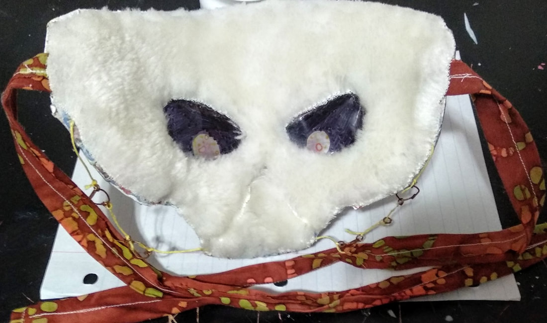
Mask 1

Mask 1 (Front)
|

Mask 1 (Back)
|
The first mask I made back in middle school, I was bored and decided to try making one out of a paper plate. This was also my first time working with paper mache, which I used to sculpt some facial features and warped around some cardboard to make the horns. The design is a little sporadic because I didn't plan anything out, and the inside has a lot of things poking through from the front. Overall not a bad first time, but I've definitely improved.
Mask 2

Mask 2 (Front)
|

Mask 2 (Back)
|
This one had a plan going in so the design is more coherent, but because I was making it out of a milk carton the paper mache didn't want to stick. The plastic-y surface also prevented paint from sticking to it properly (as you can see with the white bits on the side). I wouldn't recommend using a plastic base unless you have something that you know can adhere to it.
Mask 3

Mask 3 (Front)
|

Mask 3 (Back)
|
My first too masks were very uncomfortable to wear and more suited for display, so for the next few designs I tried to focus on wearability. This mask has a cardboard base that allows for more room and customizability than a plate would, and is also the first time I experimented with adding fabric to the back. But it often falls back into a flat shape because of its lack of structural support, making it look static and boring.
Mask 4

Mask 4 (Front)
|

Mask 4 (Back)
|
This mask was made as a companion to Mask 3, which is pretty obvious from their same shape and corresponding eye-decals. There isn't much to say since they share the same benefits and faults, although you do get a nice view of my house from these photos.
Mask 5

Mask 5 (Front)
|

Mask 5 (Back)
|
I wanted to play around with using packing tape to make clear/see-through additions to masks. I think the wings showed potential for future 3D additions, but the colored bits on the eyes turned out badly. I had accidently covered the face cut-outs with fabric, but interestingly the texture of the fabric was put on display and light could still shine through it, which was nice.
mask 6

Mask 6 (Front)
|
Mask 6 (Back)
|
This is probably the greatest success of the cardboard masks, the sculpting is dynamic and appealing and it feels pretty comfortable on the face. The one downside is that the colored tape on the eyes is hard to see through, especially at night, making it very impractical to wear.
Mask 7

Mask 7 (Front)
|

Mask 7 (Back)
|
The biggest failure of my career. I can't even say anything, everything about it bugs me. I desperately need to remake this it's like a curse on my bloodline. The shame of my family. Ugh.
Mask 8

Mask 8 (Front)
|

Mask 8 (Back)
|
I went back to trying another "beaked" mask (last seen in Mask 2) but out of cardboard this time. It turned out okay, but it isn't the greatest. The design is uniform but doesn't hold any remarkable qualities. However I used chalkboard paint on the black parts for laughs, so if you wanted to you could doodle on it with chalk.
Mask 9

Mask 9 (Front)
|

Mask 9 (Back)
|
This was made from a store-bought base so it had a good face shape. I was trying to go with a Rococo inspired design, specifically by trying to mimic Marie Antoinette's hair and makeup. After working on this I realized that a solid base shape contributes a lot to the likability of a design, so I tried to make more dramatic molds after this.
Mask 10

Mask 10 (Front)
|

Mask 10 (Back)
|
I started making bases out of aluminum by gluing multiple sheets together for strength, this made it easier to create raised/lowered parts but was difficult to make smooth or symmetrical. Once paper mache is applied it becomes incredibly solid, like a rock. Initially I had wanted to apply a layer of clay to further smooth the surface, but it cracked significantly, so my sister recommended mimicking kintsugi with the design.
[Mask 11 in progress]
Mask 12

Mask 12 (Front)
|

Mask 12 (Back)
|
I attempted to make a half-mask with the foil technique, which didn't turn out all bad. Although the nose doesn't go outward enough so it sits awkwardly on the face. This was my first attempt at making thin horns with wire and foil as a base, and they came out pretty well.
Mask 13

Mask 13 (Front)
|

Mask 13 (Back)
|
I actually made this one for a school project and rushed it out in a week, if I had more time I would have probably put more detail into the gold paint and flowers. It's a little heavy because of the clay and decorations, so wearing it is hard. I was trying to repeat the mistake from Mask 10 here, but the same clay decided not to crack on this one, so I ended up going brute-animal on it and tearing it apart with my hands. It got the job done though.
Mask 14

Mask 14 (Front)
|

Mask 14 (Back)
|
After a long and arduous journey I decided to return back to my humble origins and reunited with my one true love: paper plates. It was probably one of the best decisions I've ever made since the cardstock of the plate was both smoother than the foil and more structurally sound than the cardboard. I tried making wire-horns once again but without the foil so they would be thinner, but the mache didn't want to stick so I covered it with hot glue instead. This mask was sold at the annual Green Level Art Market (2021-2022) and was the first one to receive a proper name (besides "Mask #"), "Jewel Deer." The design was largely ad-libbed, but the end result gives me Jem and the Hologram vibes (note: I've only seen the end of the movie). I also tried a new technique on the back: flocking (the way velvet linings in jewelry boxes are made). However proper flocking stuff is really expensive so I played it by ear using shredded yarn-wefts and clear glue. It didn't turn out horrible but I'm never doing it again.
Mask 15

Mask 15 (Front)
|

Mask 15 (Back)
|
This mask was also made for the annual Green Level Art Market (2021-2022), named "Guardian." The horns were based on tanabata trees I'd often see in anime, the colorful strips always looked so beautiful hanging from the branches that I wanted to mimic that. The symbols are meaningless but that means you can add whatever meaning you want. Besides the horns I had no thoughts about the rest of the design and just head-emptied my way through the face. I'm pretty happy with how it turned out.
Mask 16

Mask 16 (Front)
|

Mask 16 (Back)
|

Mask 16 (Detail)
I think you'd probably guess this by now but yes, this was also made for the annual Green Level Art Market (2021-2022), dubbed "Concealed." This design was based around a lovely starry mesh I received. I wanted a mask using it as a veil, so I created some large horns for it to hang off of. I made the horns using layers of foil and hot glue, but it used more glue than expected and got surprisingly heavy, and drags the mask down. So I wouldn't recommend that technique for larger horns. I then added a lot of gold glitter and gems to the face to act like "hidden treasure." I liked the final design, but it's face is hard to see at most angles and lightings, which is sad.
Mask 17

Mask 17 (Front)
|

Mask 17 (Back)
|
Made for the annual Green Level Art Market (2022-2023 this time!), I sadly gave into my anime-loving urges and gave it the very cringy name of "Grand Blue Stormy" (it may be embarrassing but I have no regrets!). I had asked my friends for a prompt and one of them responded with "knobbed hornbill," and I was immediately taken by the color palette (blue-orange is my favorite color combination) so I had to do it. I really wanted to capture the striking blue under the bird's boll so I dedicate the lower portion of the mask to that gradient, and added a white mini-mask feature around the eyes to add interest. The horns also try to imitate the bill with their diagonal details, and the largest horn was made hollow and open at the back like a bird beak. Although somehow through all of this I forgot to add the "knobbed" part of "knobbed hornbill," a mistake that has brought dishonor on my family and will remain the shame of my entire career (that is a joke, nothing is worse than Mask 7).
Mask 18

Mask 18 (Front)
|

Mask 18 (Back)
|

Mask 18 (Detail 1)
|

Mask 18 (Detail 2)
|

Mask 18 (Detail 3)
|
Collaboration piece made for the annual Green Level Art Market (2022-2023) with my friend Harshini Yedavelli, who did the quilling. It was named "Matilda" (because it looked like a "Matilda"). I love how colorful the piece turned out, it almost reminds me of stained glass you would see in a chapel or something. I only made the base and did the painting, but this is definitely the most labor-intensive mask yet.
